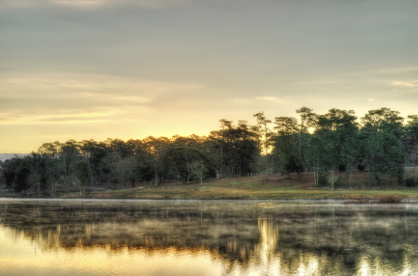
Mobile, Alabama. I was experimenting with high-definition range here. While I managed to get the steam to 'pop' off the water, overall, I did not like this photo. The sun made the center section of the photograph overexposed.
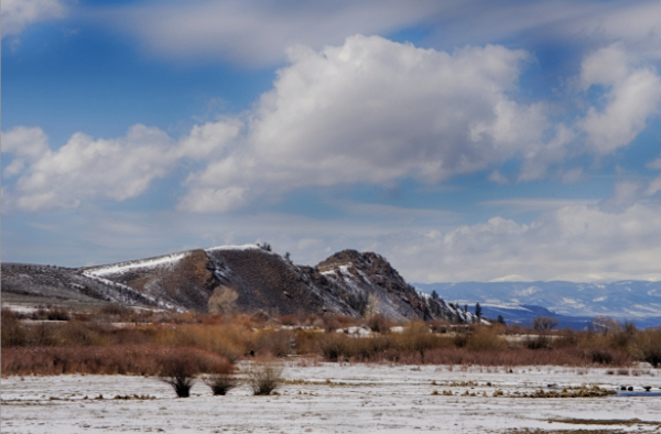
Colorado: It was almost perfect, except for the lower right lines in the snow. However, the subject is quite boring.
Colorado: The brown 'flat-top hill' swirl on the left side ruined this photo.
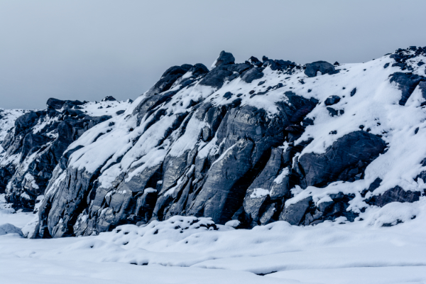
On top of Katla Volcano in Iceland—a very boring subject. Fun fact: This is a full-color photograph.
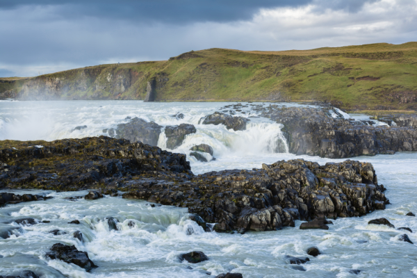
One of the last photographs ever taken of this now-extinct waterfall in Iceland. A historic shot, though quite boring. FYI: They either completely diverted the river or built a dam for hydroelectric power.
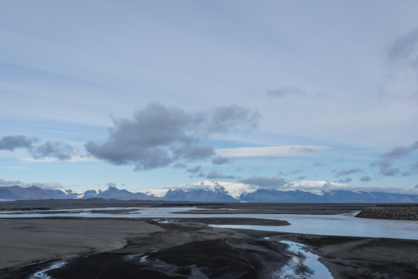
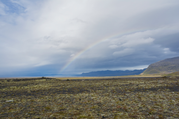
The wastelands of Iceland—I like it, but I knew others would not, so it ended up in the bad pile.
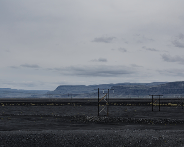
Another photo of the wastelands—I really like this one. If I were to hang it on my wall, I would crop out most of the sky to create a long, panoramic effect. That said, it is just a boring shot.
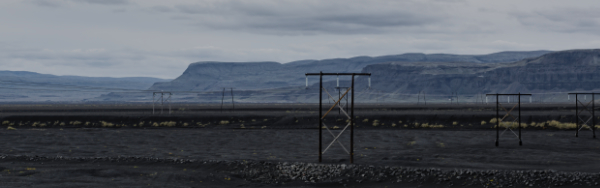
Maybe something like this…
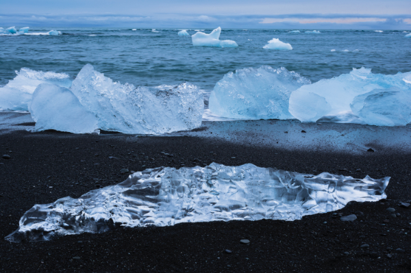
Iceland: The foreground is exciting, but overall, the photo is too cluttered due to the middle row of icebergs. Additionally, the center background iceberg looks like a bunny rabbit.
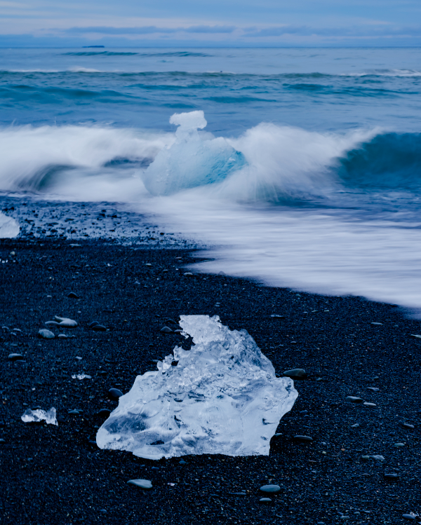
Iceland: A barely okay photo, but the background iceberg has an arrow-like protrusion that I cannot ignore.
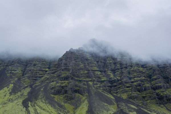
Iceland: I like the concept, but it is missing something. If I crop the clouds more, the misty mountain effect would be lost.
Iceland: Nothing wrong with this photo other than it looks like a cellphone shot.
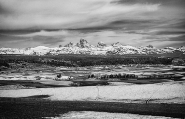
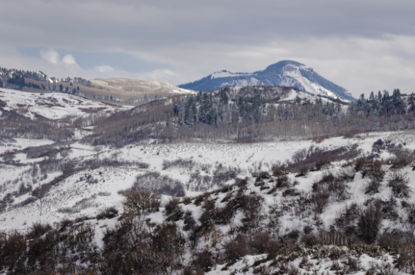
Grand Tetons, Idaho side: The mountains are in focus but look 'off,' and it would have been better without the tire tracks in the snow.
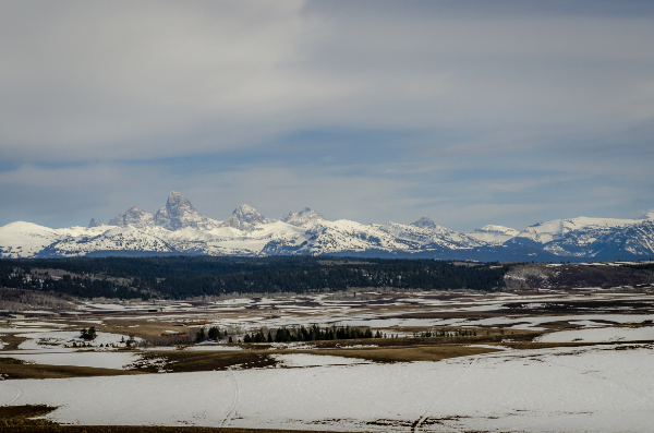
Grand Tetons, Idaho side: From the same photo set, slightly repositioned. The mountains still look 'off' to me, like they were photoshopped in? Certainly not the case.
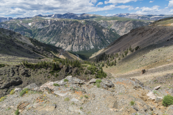
Montana: The photo looked too cluttered on the right side of the foreground.
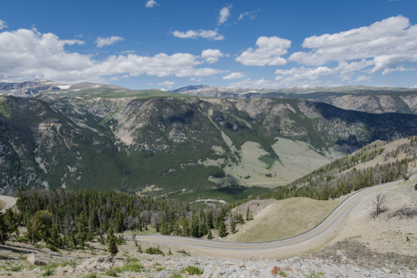
Montana: The road looked pretty in real life, but not so much in the photograph. Maybe if the road had been darker, it would have helped, but I still would have rejected it due to the cloud shadow taking up much of the center-right side.
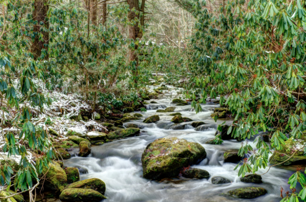
Tennessee: I got cold and very wet for this photo. Mentally, to someone viewing it, green leaves and snow just do not mix.
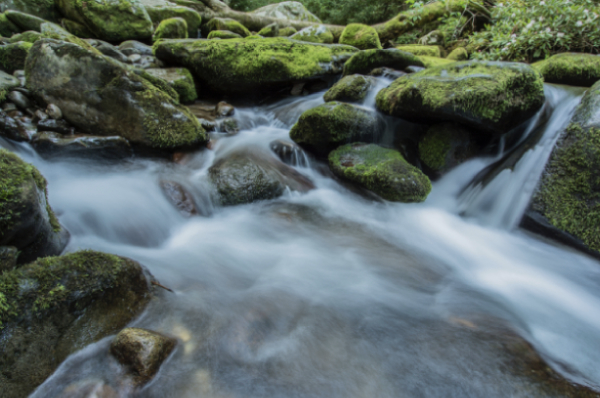
Tennessee: The entire water section was only about two or three feet wide, and this is noticeable to me.
Tennessee: I like this photo, except for the obnoxious diagonal tree in the right foreground.
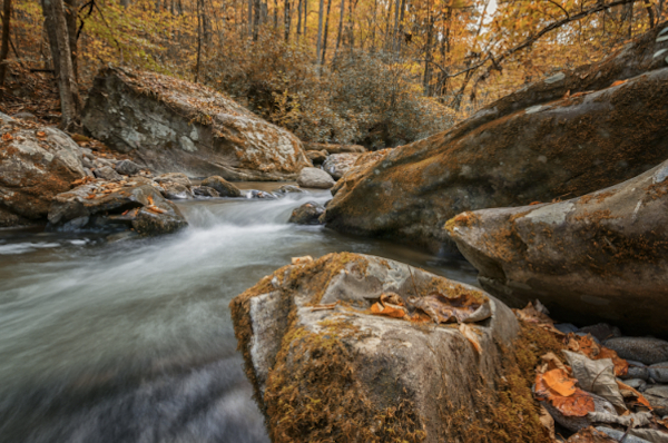
Tennessee: It is an okay photo, but the upper-right diagonal branch ruins it.
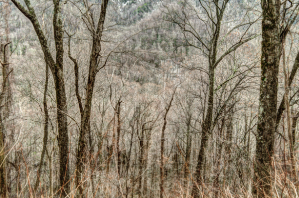
Tennessee: I like this photo a lot. The trees look odd because I was lying on the ground off the side of a cliff. If you look closely, the top portion is not sky—it is the next hill over. It's in the 'bad pile' because if you have to explain any photograph to someone, it is always a bad photo.
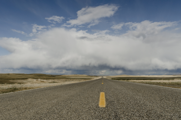
Wyoming: I have always wanted to take a shot like this. It looks as if the clouds parted for the road. If the clouds were more defined, it would have been better. As is, it is just barely an okay shot due to a lack of cloud definition.
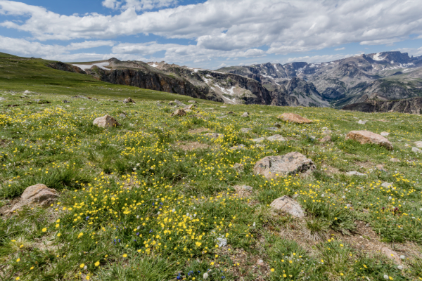
Wyoming: Technically, the photo is fine with the flowers and snow. I adjusted the color values, but something still feels off.
That is how I personally critique my own and others' photographs.